

Institutional > Visual Identity
Visual Identity

When we look at the letter sequence of the word "Konyaaltı", the fact that two pyramid-shaped 'A' letters come side by side might seem like a negative aspect at first glance, but this situation has been turned into a positive with creativity and design thinking; the two 'A' letters were designated as a "dissonance point" in form development.
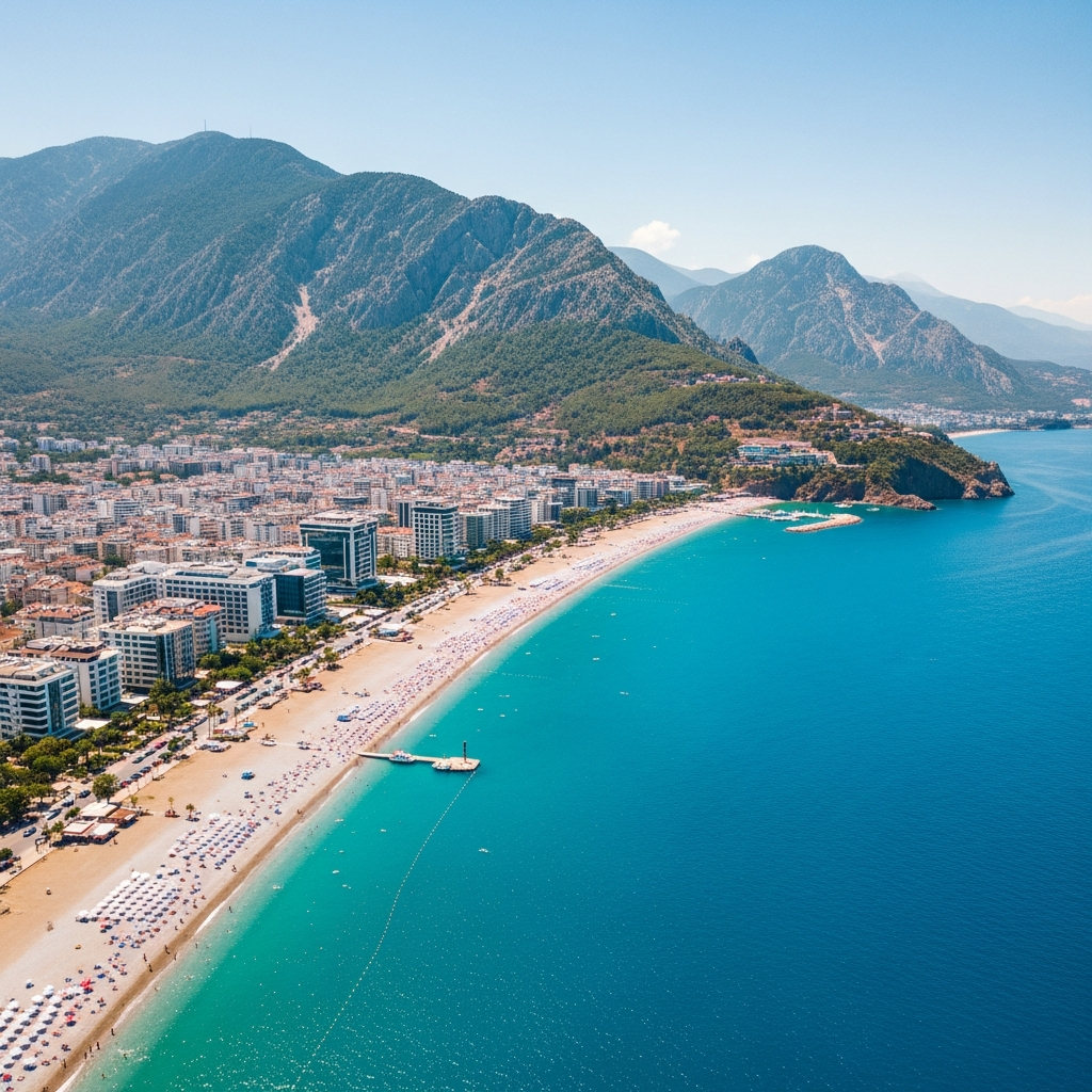
This thought became the symbolic expression of the Bey Mountains, which surround the Konyaaltı District from the west, descending into the sea. The symbolic representation of nature, sea, and sun was also strengthened by two free spots of different colors passing diagonally through the center of the letters.
In the logotype containing the symbolic expression of Konyaaltı Municipality;
- Parliament blue: expressing the strong portrayal of the Bey Mountains
- Turquoise: expressing the widespread recognition of Konyaaltı sea
- Orange: expressing the representation of the bright sun.
Preserving corporate colors is of great importance in terms of communication integrity in designs. For the use of the logo and corporate elements in various mediums, colors have been coded and determined in accordance with the color profiles of the mediums.
Pantone codes are used in cases where colors are applied as spot colors.


